Dashboard
The Dashboard is the first screen you see after logging in. It provides a quick overview of the entire enterprise architecture status.
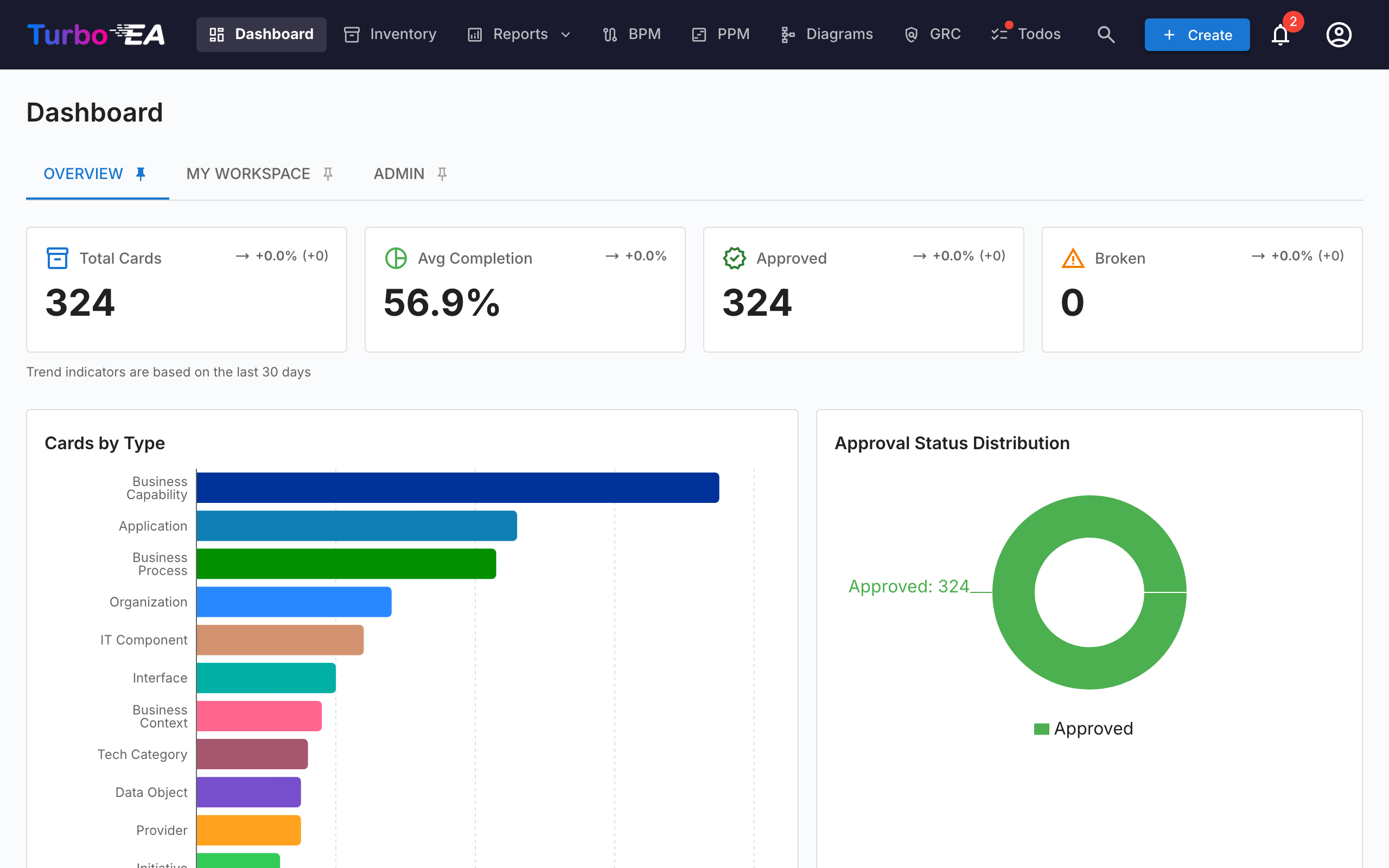
Top Navigation Bar
At the top of the screen, you will find the main navigation bar with the following elements:
- Turbo EA (logo): Click to return to the Dashboard from any section
- Dashboard: Overview of the architecture status
- Inventory: Complete listing of all cards
- Reports: Visual and analytical reports
- BPM: Business Process Management (if enabled)
- Diagrams: Visual architecture diagram editor
- EA Delivery: Architecture initiative management
- Todos: Pending tasks and assigned surveys
- Search cards: Quick search bar with autocomplete
- + Create: Button to quickly create new cards
- Notification bell: System alerts and notifications
- Profile icon: Language selection, theme toggle, notification preferences, and administration access
Summary Cards
The main section of the Dashboard displays summary cards indicating:
- Total number of cards: Count of all components registered in the platform
- Distribution by type: How many elements of each type exist (Applications, Organizations, Objectives, Capabilities, etc.)
- Status overview: Quick visualizations of the overall status
Clicking on a type card navigates to the Inventory pre-filtered to that type.
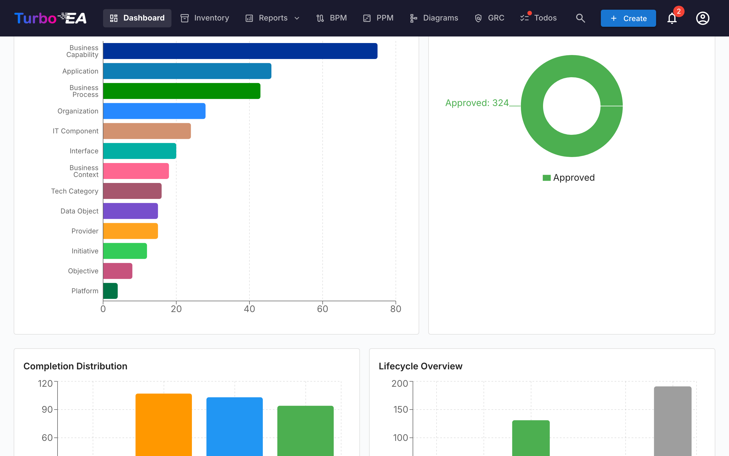
Charts and Statistics
In the bottom section of the Dashboard you will find:
- Distribution by type chart: Shows the proportion of each card type in your landscape
- Approval status: Indicates how many cards are approved, pending, broken, or rejected
- Data quality: Overall percentage of information completeness across all cards
- Recent activity: A feed of the latest changes — who edited what and when
Workspace tab
The Workspace tab pulls together everything assigned to you: favorites, todos, pending surveys, recent activity on your cards, and the Cards I Have a Role In section.
That last section groups cards by the stakeholder role you hold (Application Owner, Business Owner, etc.) and lists the cards under each. If your role grants the stakeholders.view permission (admin, member and viewer roles by default), a small person search icon next to the section title lets you point it at someone else — pick a user from the autocomplete and the section refetches and re-renders with that user's roles and cards. The section title flips to "Roles held by {name}". Click the small close icon to return to your own roles. Useful for answering "what does this person own?" in one click.
Admin tab — Stakeholder directory
Administrators (any role with admin.users) get a Stakeholder directory widget at the bottom of the Admin tab. It lists every card type that has at least one stakeholder, with the count of distinct holders for each. Expand a card type to see its roles, and inside each role the users who hold it together with the number of cards they cover. Click a user chip to expand its card list inline — each card name is itself a link to the card detail page. The whole tree (card type → role → user → cards) comes back in a single round-trip, so navigation is instant.
A name filter at the top of the widget narrows the tree to users matching the typed name or email; matching card types auto-expand so the matches are visible without an extra click. Use it to answer "where does Alice appear in the org?" in one second.
Beyond the directory, a small hover popover opens whenever the cursor pauses on a stakeholder name elsewhere in the app — on a card's Stakeholders tab, on a risk owner in the Risk Register, or on the Risk Detail page — and shows that user's full role-grouped stakeholder portfolio. Click any card in the popover to jump to it. The popover fetches once per user per session.